This weekend, I did some major sprucing up around this here blog. How does she look? It’s been a few years since my last redesign so I figured now was as good a time as any to make some changes. First up, the logo. I hired my friend, Eva Black, to hand letter The Style Eater in her famous watercolor cursive and it turned out exactly how I envisioned. I mean, HOW COOL, RIGHT? I love it. Thanks, Eva!
As for the design, it’s a Blogzilla Studio theme (the mignon!) and let me tell you, they know a thing or two about making good-looking blogs. Their designs are so chic and minimal. I’ve been searching high and low for a reasonably priced, yet super cool design for SO LONG, I can’t even tell you.
Anyway, take a looksie around. There are a few new details, like a rotating list of my current favorite things (at the top!), some fun sharing tools in the posts, and an easier way to subscribe via feedly, bloglovin, and rss.
Other things I did this weekend:
-almond-macadamia milk lattes from go get em tiger
–venice in the rain
-looked at all the wedding venues
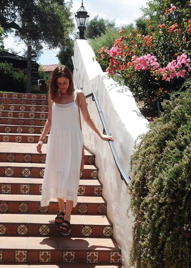
Wearing:
Free People dress
Birkenstocks (mine are Amalfi’s)
Baggu Bag


Loooove the new layout!
looks great!
Love the new look! I really like the lettering.